Chapter 5 Aggregation and pivoting data: part 2
Scenario. You have created several pivot tables and pivot charts for Lucy.
Load libraries
library(tidyverse)
library(scales)
library(RColorBrewer)
Load data for this lab:
my_data <- readRDS("./data/processing/data4week3.rds")
str(my_data)
## Classes 'tbl_df', 'tbl' and 'data.frame': 113036 obs. of 19 variables:
## $ Date : POSIXct, format: "2013-11-26" "2015-11-26" ...
## $ Year : num 2013 2015 2014 2016 2014 ...
## $ Month : num 11 11 3 3 5 5 5 5 2 2 ...
## $ Customer ID : num 11019 11019 11039 11039 11046 ...
## $ Customer Age : num 19 19 49 49 47 47 47 47 35 35 ...
## $ Age Group : chr "Youth" "Youth" "Adults" "Adults" ...
## $ Customer Gender : chr "M" "M" "M" "M" ...
## $ Country : chr "Canada" "Canada" "Australia" "Australia" ...
## $ State : chr "British Columbia" "British Columbia" "New South Wales" "New South Wales" ...
## $ Product Category: chr "Accessories" "Accessories" "Accessories" "Accessories" ...
## $ Sub Category : chr "Bike Racks" "Bike Racks" "Bike Racks" "Bike Racks" ...
## $ Product : chr "Hitch Rack - 4-Bike" "Hitch Rack - 4-Bike" "Hitch Rack - 4-Bike" "Hitch Rack - 4-Bike" ...
## $ Frame Size : num NA NA NA NA NA NA NA NA NA NA ...
## $ Order Quantity : num 8 8 23 20 4 5 4 2 22 21 ...
## $ Unit Cost : num 45 45 45 45 45 45 45 45 45 45 ...
## $ Unit Price : num 120 120 120 120 120 120 120 120 120 120 ...
## $ Cost : num 360 360 1035 900 180 ...
## $ Revenue : num 950 950 2401 2088 418 ...
## $ Profit : num 590 590 1366 1188 238 ...So far everything has been well received by her. However, she would like to have easier ways to slice and dice the reports and charts herself. You sat down with Lucy, and come up with several different ways that Lucy could slice the data
- Year
- Country
- Customer Gender
- Age Group
- Product Category
- Sub Category
- Frame size
In this Lab we continue to work with data from previous lab and with the same type of charts but will use other data subsets.
Set common theme for line charts
line_theme <- theme_classic() +
    theme(plot.title = element_text(face = "bold", hjust = 0.5),
          panel.grid.major = element_line(colour = "gray"),
          panel.grid.minor = element_line(colour = "gray", size = 0.1),
          legend.title = element_text(face = "bold", colour = "black", size = 12),
          legend.text = element_text(size = 11, color = "black"),
          axis.text = element_text(size = 11, colour = "black"),
          axis.title = element_text(size = 12, face = "bold"))
Set common theme for pie charts
pie_theme <- theme(panel.background = element_rect(fill = "white", color = "white"),
          plot.title = element_text(face = "bold", size = 15, hjust = 0.5),
          #legend.title = element_blank(),
          legend.title = element_text(face = "bold", colour = "black", size = 12),
          legend.text = element_text(size = 11, color = "black"),
          axis.text = element_blank(),
          axis.ticks = element_blank())
5.1 A quick glance on the yearly sales by country shows that Australia has an unusual trend compared to the other countries. Which year does Australia have the least sales?
my_data %>%
    group_by(Year, Country) %>%
    summarise(Total = sum(Revenue)) %>%
    ggplot(aes(x = Year, y = Total, color = reorder(Country, -Total))) +
    geom_line(size = 1.2) +
    geom_point(size = 2) +
    scale_y_continuous(breaks = seq(0, 7e6, by = 1e6), labels = scales::dollar,
                       limits = c(0, 7e6), expand = c(0, 0)) +
    labs(x = "Year", y = "Total Revenue", color = "Country", title = "Yearly Sales by Country") +
    scale_colour_brewer(palette = "Dark2") +
    line_theme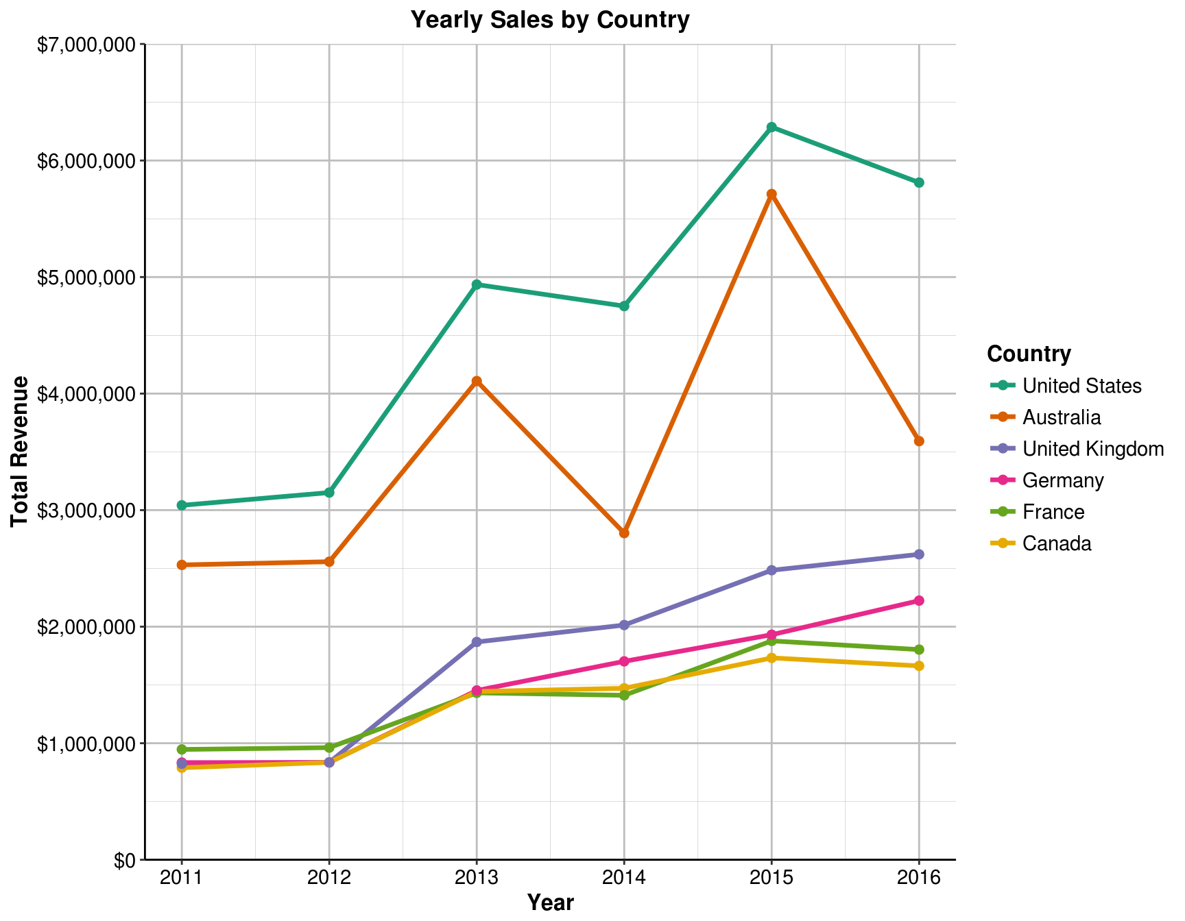
Answer: 2011
Create an additional pivot chart to show Sales by Country using pie chart. Show percentages for each slice of the pie. Overall, Australia commands 25% of the company’s total sales. But in some of the years, this proportion changes.
5.2 What is the percentage of Australia sales (of total sales) in the year that it has the least sales (previous question)?
my_data %>%
    filter(Year == "2011") %>%
    group_by(Country) %>%
    summarise(Total = sum(Revenue)) %>%
    arrange(desc(Total)) %>%
    mutate(Prop = formatC(Total / sum(Total), digits = 3, format = "f") %>%
               as.numeric(),
           Percent = paste(Prop * 100, "%"),
           y_tick = cumsum(Prop) - Prop / 2) %>%
    ggplot(aes(x = "", y = Prop, fill = reorder(Country, -Prop))) +
      geom_bar(width = 1, stat = "identity", colour = "white", size = 0.7) +
      coord_polar(theta = "y") +
      labs(title = "Sales by Country", x = NULL, y = NULL, fill = NULL) +
      geom_text(aes(x = c(1.0, 1.1, 1.2, 1.25, 1.25, 1.3), y = 1 - y_tick, label = Percent), size = 5) +
      scale_fill_brewer(palette = "Dark2") +
      pie_theme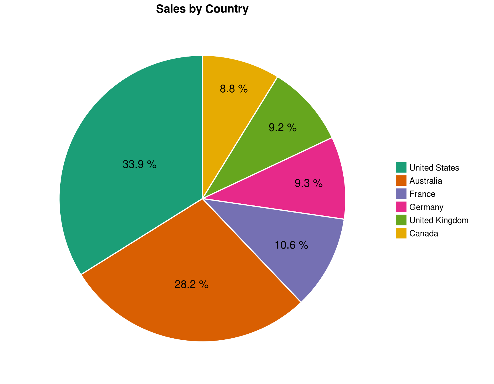
Answer: 28.2%
5.3 Let’s filter the charts by Australia. What might be the cause of this trend?
my_data %>%
    filter(Country == "Australia", Year > 2012) %>%
    group_by(Year, `Product Category`) %>%
    summarise(Total = sum(Revenue)) %>%
    ggplot(aes(x = Year, y = Total, color = reorder(`Product Category`, - Total))) +
      geom_line(size = 1.2) +
      geom_point(size = 2) +
      scale_y_continuous(labels = scales::dollar, limits = c(0, 5e6), expand = c(0, 0)) +
      labs(x = "Year", y = "Total Revenue", color = " Product\nCategory", title = "Australia Sales by Category") +
      scale_colour_brewer(palette = "Set2") +
      line_theme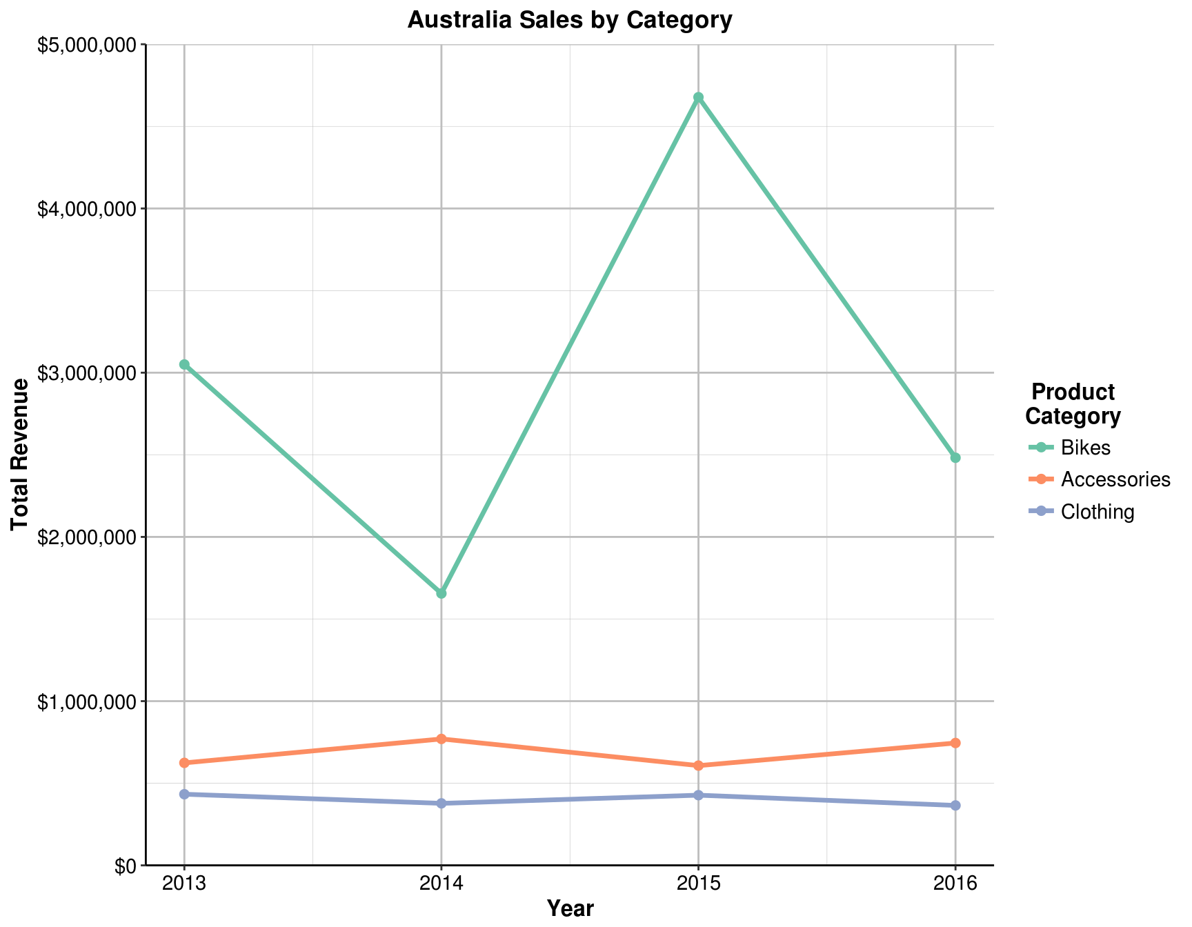
Answer: the sharp fluctuations of bicycle sales
5.4 For all the years that has all the three categories, which year does the Bikes has the least proportion?
Answer: 2014
Based on your hypothesis (previous question), create an additional pivot chart to show Sales by Category using pie chart. Show percentages for each slice of the pie chart. Filter the charts by Australia and play around with the Year filter. Notice for different years, the changes in composition of Australia sales by Category.
5.5 What is the percentage of bikes sales (of total sales) in that year?
my_data %>%
    filter(Country == "Australia", Year == 2014) %>%
    group_by(`Product Category`) %>%
    summarise(Total = sum(Revenue)) %>%
    mutate(Prop = formatC(Total / sum(Total), digits = 2, format = "f") %>%
               as.numeric(),
           Percent = paste(Prop * 100, "%"),
           y_tick = cumsum(Prop) - Prop / 2) %>%
    ggplot(aes(x = "", y = Prop, fill = `Product Category`)) +
      geom_bar(width = 1, stat = "identity", colour = "white", size = 0.7) +
      coord_polar(theta = "y") +
      labs(title = paste("Proportion by Product Category for Australia in", 2014), x = NULL, y = NULL, fill = NULL) +
      geom_text(aes(x = c(1.2, 1.2, 1.3), y = 1 - y_tick, label = Percent), size = 9) +
      scale_fill_brewer(palette = "Set2") +
      pie_theme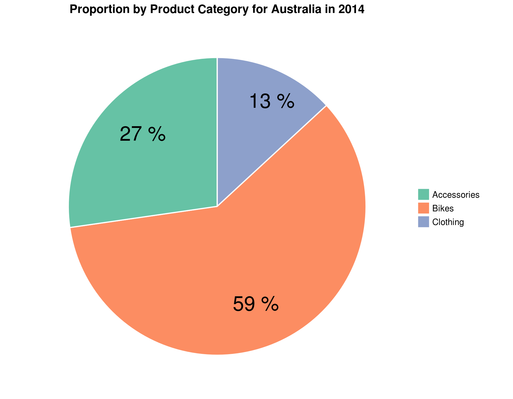
Answer: 59%
Next, create an additional pivot chart to show Sales by Customer Gender using pie chart. Show percentages for each slice of the pie. Overall, it is split evenly with 51%:49% of Male to Female ratio.
5.6 Which bike’s frame size is more popular for each gender?
my_data %>%
    filter(!is.na(`Frame Size`)) %>%
    group_by(`Frame Size`, `Customer Gender`) %>%
    summarise(Total = sum(Revenue)) %>%
    ggplot(aes(x = factor(`Frame Size`), y = Total, fill = factor(`Customer Gender`))) +
      geom_bar(stat = "identity", position = position_dodge(0.6), width = 0.5) +
      scale_x_discrete(expand = c(0.01, 0)) +
      scale_y_continuous(labels = scales::dollar, expand = c(0.01, 0)) +
      labs(x = "Frame Size", y = NULL, fill = "Customer\n  Gender") +
      theme(panel.background = element_rect(fill = "white"),
            legend.title = element_text(colour = "black", size = 10, face = "bold"),
            legend.text = element_text(colour = "black", size = 10, face = "bold"),
            legend.position = c(.95, .93),
            legend.background = element_rect(color = "black"),
            axis.line = element_line(colour = "black"),
            axis.text = element_text(size = 10, colour = "black"),
            axis.title = element_text(size = 12))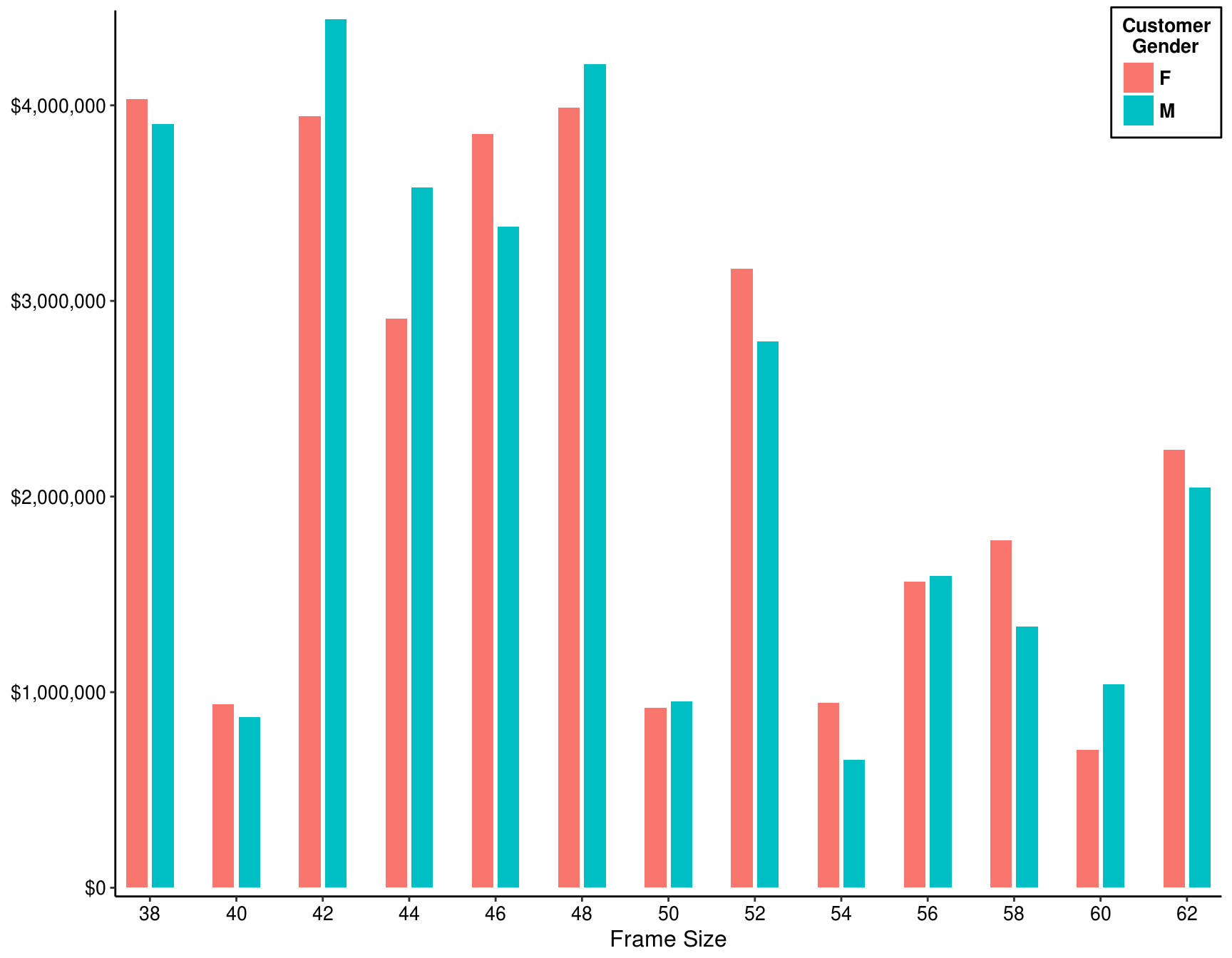
Answer: Mail - 42; Femail - 38
What about Customer Gender vs Age Group? Right now the Sales by Age Group chart does not differentiate by Gender. Modify this chart to be a column chart. Show the Customer Gender side-by-side for each age group. Sort the Age Group appropriately.
5.7 In Australia, which age group has more sales revenue to females than to males? (Select two that apply)
my_data %>%
    filter(Country == "Australia") %>%
    group_by(`Age Group`, `Customer Gender`) %>%
    summarise(Total = sum(Revenue)) %>%
    mutate(Prop = formatC(Total / sum(Total), digits = 3, format = "f") %>%
               as.numeric(),
           Percent = paste(Prop * 100, "%")) %>%
    ggplot(aes(x = `Age Group`, y = Prop, fill = `Customer Gender`)) +
      geom_bar(stat = "identity", position = position_dodge(0.8), width = 0.75) +
      scale_x_discrete(expand = c(0.01, 0)) +
      scale_y_continuous(expand = c(0.01, 0), breaks = seq(0, .8, by = .1),
                         labels = map_chr(seq(0, 80, by = 10) ,paste0, "%")) +
      labs(x = NULL, y = "Sales", fill = "Customer Gender: ") +
      geom_text(aes(label = Percent), vjust = 1.7, colour = "black", position = position_dodge(0.8), size = 5) +
      theme(legend.position = "top",
            panel.background = element_rect(fill = "white"),
            legend.title = element_text(colour = "black", size = 12, face = "bold"),
            legend.background = element_rect(colour = "black"),
            legend.text = element_text(colour = "black", size = 12, face = "bold"),
            axis.line = element_line(colour = "black"),
            axis.text = element_text(size = 12, colour = "black"),
            axis.title = element_text(size = 12, face = "bold"))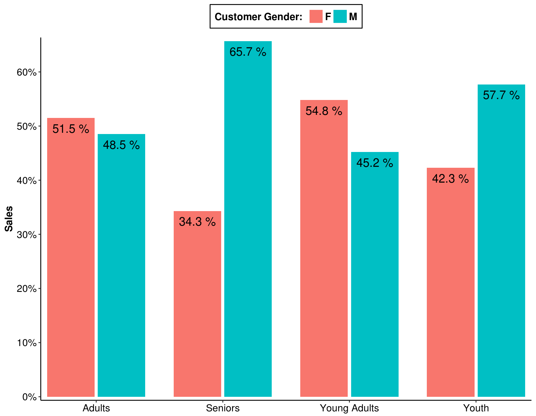
Answer: 1-Young Adults (25-34); 2-Adults (35-64)