Chapter 4 Aggregation and pivoting data: part 1
Scenario. Now that you have prepared the data, you can start to create pivot tables to aggregate the data and create some reports. From your conversation with Lucy, you know that she is interested in looking into the yearly sales data broken down by Countries, Product Categories and Age Groups.
Load libraries
library(tidyverse)
library(knitr)
library(scales)
library(RColorBrewer)
Load data for this lab:
my_data <- readRDS("./data/processing/data4week3.rds")
str(my_data)
## Classes 'tbl_df', 'tbl' and 'data.frame': 113036 obs. of 19 variables:
## $ Date : POSIXct, format: "2013-11-26" "2015-11-26" ...
## $ Year : num 2013 2015 2014 2016 2014 ...
## $ Month : num 11 11 3 3 5 5 5 5 2 2 ...
## $ Customer ID : num 11019 11019 11039 11039 11046 ...
## $ Customer Age : num 19 19 49 49 47 47 47 47 35 35 ...
## $ Age Group : chr "Youth" "Youth" "Adults" "Adults" ...
## $ Customer Gender : chr "M" "M" "M" "M" ...
## $ Country : chr "Canada" "Canada" "Australia" "Australia" ...
## $ State : chr "British Columbia" "British Columbia" "New South Wales" "New South Wales" ...
## $ Product Category: chr "Accessories" "Accessories" "Accessories" "Accessories" ...
## $ Sub Category : chr "Bike Racks" "Bike Racks" "Bike Racks" "Bike Racks" ...
## $ Product : chr "Hitch Rack - 4-Bike" "Hitch Rack - 4-Bike" "Hitch Rack - 4-Bike" "Hitch Rack - 4-Bike" ...
## $ Frame Size : num NA NA NA NA NA NA NA NA NA NA ...
## $ Order Quantity : num 8 8 23 20 4 5 4 2 22 21 ...
## $ Unit Cost : num 45 45 45 45 45 45 45 45 45 45 ...
## $ Unit Price : num 120 120 120 120 120 120 120 120 120 120 ...
## $ Cost : num 360 360 1035 900 180 ...
## $ Revenue : num 950 950 2401 2088 418 ...
## $ Profit : num 590 590 1366 1188 238 ...4.1 Which year did the company start selling touring bikes?
ans_1 <- my_data %>%
    arrange(Date) %>%
    filter(`Sub Category` == 'Touring Bikes') %>%
    select(Date, `Product Category`, `Sub Category`)
kable(ans_1[1:10,])| Date | Product Category | Sub Category |
|---|---|---|
| 2013-07-01 | Bikes | Touring Bikes |
| 2013-07-01 | Bikes | Touring Bikes |
| 2013-07-01 | Bikes | Touring Bikes |
| 2013-07-02 | Bikes | Touring Bikes |
| 2013-07-02 | Bikes | Touring Bikes |
| 2013-07-03 | Bikes | Touring Bikes |
| 2013-07-03 | Bikes | Touring Bikes |
| 2013-07-03 | Bikes | Touring Bikes |
| 2013-07-03 | Bikes | Touring Bikes |
| 2013-07-04 | Bikes | Touring Bikes |
Answer: 2013
4.2 Rank the states for Germany, from the highest to lowest revenue
my_data %>%
    filter(Country == 'Germany') %>%
    group_by(State) %>%
    summarise(Total = sum(Revenue)) %>%
    arrange(desc(Total)) %>%
    ggplot(aes(x = reorder(State, Total), y = Total, fill = State)) +
    geom_bar(stat = "identity", width = .6, show.legend = FALSE) +
    scale_y_continuous(labels = scales::dollar, expand = c(.01, 0)) +
    scale_x_discrete(expand = c(0.01, 0)) +
    coord_flip() +
    labs(title = "Revenue by states", y = NULL, x = NULL) +
    theme_classic() +
    theme(panel.background = element_rect(fill = "white", color = "white"),
          plot.title = element_text(face = "bold", hjust = 0.5),
          axis.text = element_text(size = 11, colour = "black"),
          axis.title = element_text(size = 12, face = "bold"))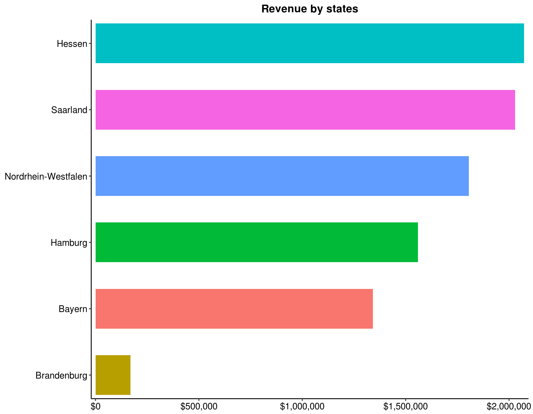
4.3 Rank the states for Germany, from the highest to lowest revenue for year 2013
my_data %>%
    filter(Country == 'Germany', Year == 2013) %>%
    group_by(State) %>%
    summarise(Total = sum(Revenue)) %>%
    arrange(desc(Total)) %>%
    ggplot(aes(x = reorder(State, Total), y = Total, fill = State)) +
    geom_bar(stat = "identity", width = .65, show.legend = FALSE) +
    scale_y_continuous(labels = scales::dollar, expand = c(0.01,0)) +
    scale_x_discrete(expand = c(0.01,0)) +
    coord_flip() +
    labs(title = "Revenue by states", x = NULL, y = NULL) +
    theme_classic() +
    theme(panel.background = element_rect(fill = "white", color = "white"),
          plot.title = element_text(face = "bold", hjust = 0.5),
          axis.text = element_text(size = 11, colour = "black"),
          axis.title = element_text(size = 12, face = "bold"))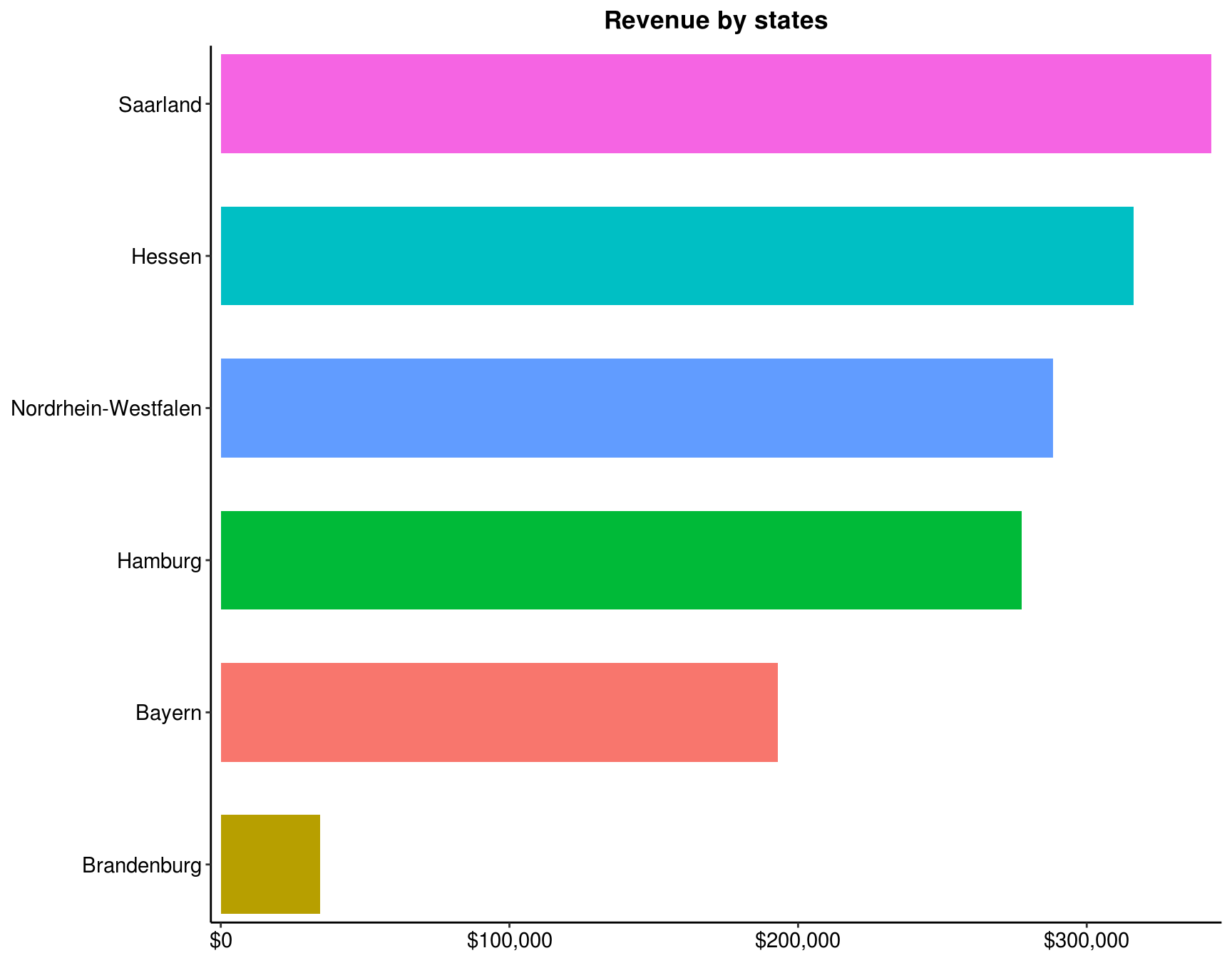
4.4 Which frame size sold the most?
my_data %>%
    filter(`Product Category` == 'Bikes') %>%
    group_by(`Frame Size`) %>%
    summarise(Total = sum(Revenue)) %>%
    arrange(desc(Total)) %>%
    ggplot(aes(x = reorder(`Frame Size`, Total), y = Total)) +
    geom_bar(stat = "identity", width = .5, fill = "tomato2") +
    scale_y_continuous(labels = scales::dollar, expand = c(0.01, 0)) +
    coord_flip() +
    geom_text(aes(label = paste("$", prettyNum(Total, ","))),
              hjust = 1.1, colour = "black") +
    labs(title = "Revenue by Frame Size", x = "Frame Size", y = NULL) +
    theme_classic() +
    theme(panel.background = element_rect(fill = "white", color = "white"),
          plot.title = element_text(face = "bold", hjust = 0.5),
          axis.text = element_text(size = 11, colour = "black"),
          axis.title = element_text(size = 12, face = "bold"))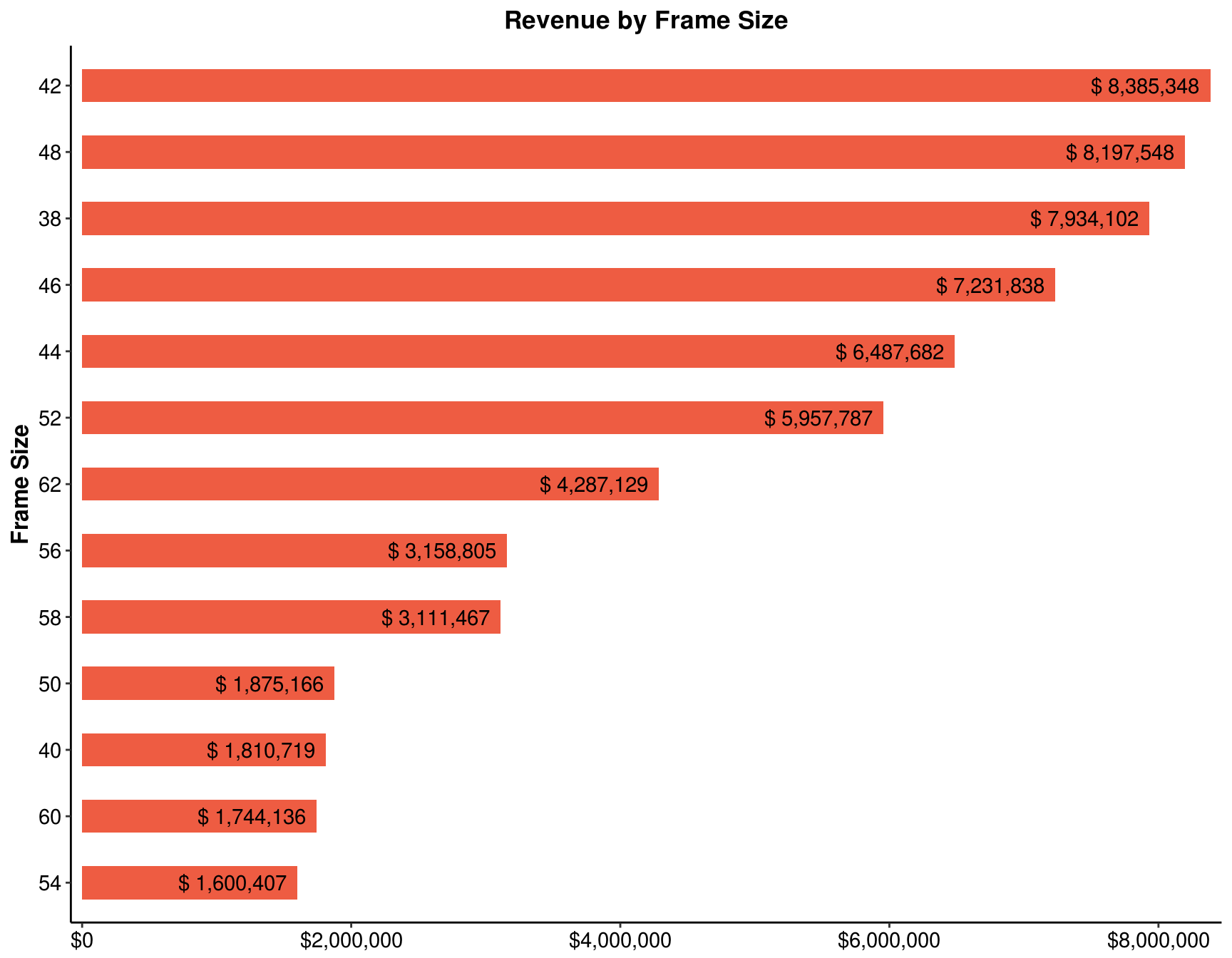
4.5 Which age group has the lowest revenue?
my_data %>%
    group_by(`Age Group`) %>%
    summarise(Total = sum(Revenue)) %>%
    arrange(Total) %>%
    ggplot(aes(x = reorder(`Age Group`, -Total), y = Total, fill = `Age Group`)) +
    geom_bar(stat = "identity", width = .5, show.legend = FALSE) +
    scale_y_log10(breaks = c(1e5, 1e6, 1e7, 2e7), expand = c(0.01, 0),
                  limits = c(1e5, 2e7), oob = scales::squish, labels = scales::dollar) +
    scale_x_discrete(expand = c(0.01, 0)) +
    labs(title = "Revenue by Age Group", x = NULL, y = NULL) +
    theme_classic() +
    theme(panel.background = element_rect(fill = "white", color = "white"),
          plot.title = element_text(face = "bold", hjust = 0.5),
          axis.text = element_text(size = 11, colour = "black"),
          axis.title = element_text(size = 12, face = "bold"))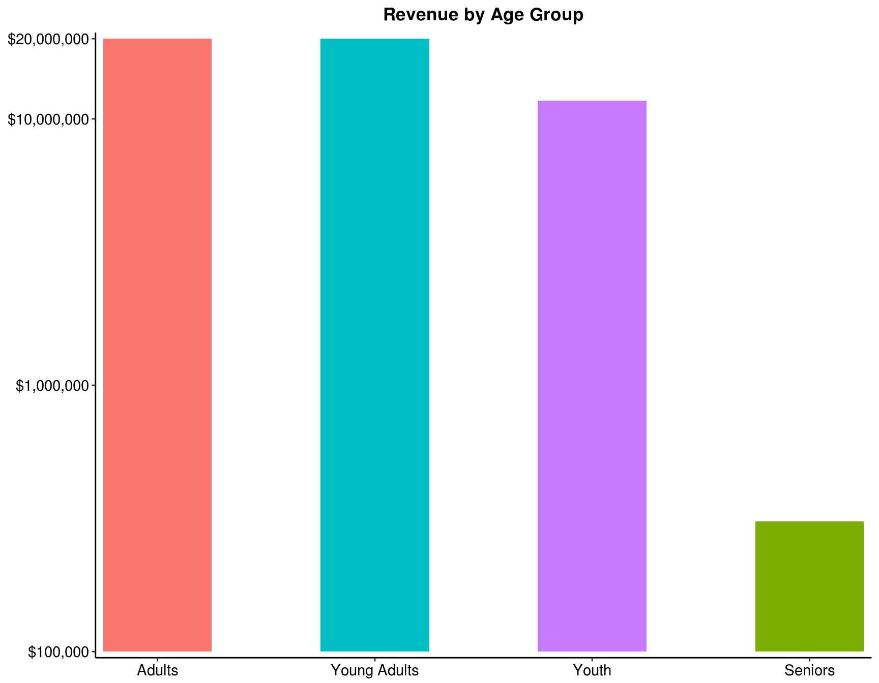
Now add a chart that shows yearly Sales by Country. Select a line chart to display the yearly trend. Make sure that the years are located in the X axis, the Revenue in the Y axis, and the Countries as categories.
In this chart, you can clearly see the sales trend for each Country.
Set common theme for line charts:
line_theme <- theme_classic() +
    theme(plot.title = element_text(face = "bold", hjust = 0.5),
          panel.grid.major = element_line(colour = "gray"),
          panel.grid.minor = element_line(colour = "gray", size = 0.1),
          legend.title = element_text(face = "bold", colour = "black", size = 12),
          legend.text = element_text(size = 11, color = "black"),
          axis.text = element_text(size = 11, colour = "black"),
          axis.title = element_text(size = 12, face = "bold"))
4.6 Which country’s trend is the most different when compared to the other countries?
my_data %>%
    group_by(Year, Country) %>%
    summarise(Total = sum(Revenue)) %>%
    ggplot(aes(x = Year, y = Total, color = reorder(Country, -Total))) +
    geom_line(size = 1.2) +
    geom_point(size = 2) +
    scale_y_continuous(breaks = seq(0, 6e6, by = 1e6), labels = scales::dollar,
                       limits = c(0, 6.5e6), expand = c(0, 0)) +
    labs(title = "Yearly Sales by Country", x = NULL, y = NULL, color = NULL) +
    line_theme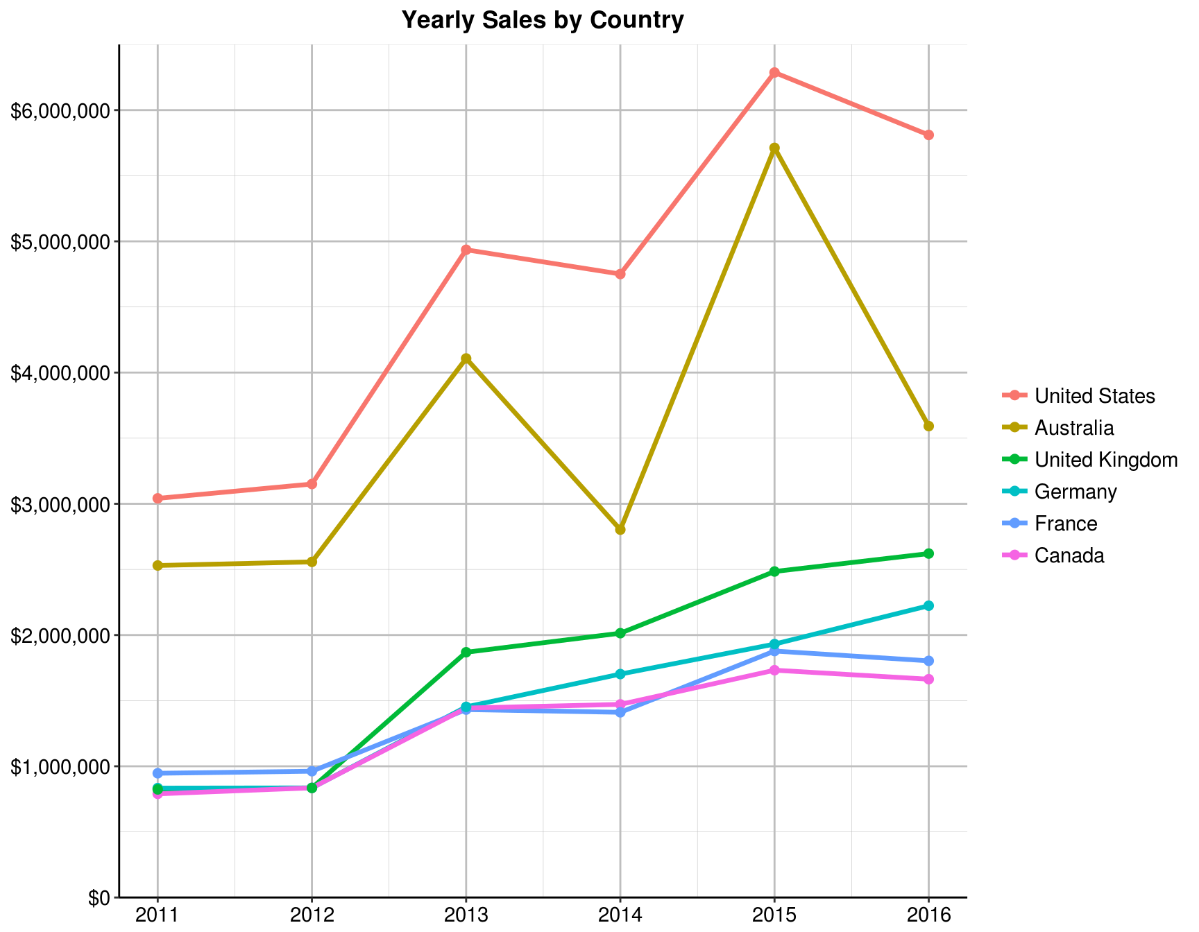
Answer: Australia
4.7 Which year does the Bikes category have the least sales?
my_data %>%
    group_by(Year, `Product Category`) %>%
    summarise(Total = sum(Revenue)) %>%
    ggplot(aes(x = Year, y = Total, color = reorder(`Product Category`,- Total))) +
    geom_line(size = 1.2) +
    geom_point(size = 2) +
    scale_y_continuous(limits = c(0, 15e6),labels = scales::dollar, expand = c(0, 0)) +
    labs(title = "Yearly Sales by Category", x = NULL, y = NULL, color = NULL) +
    line_theme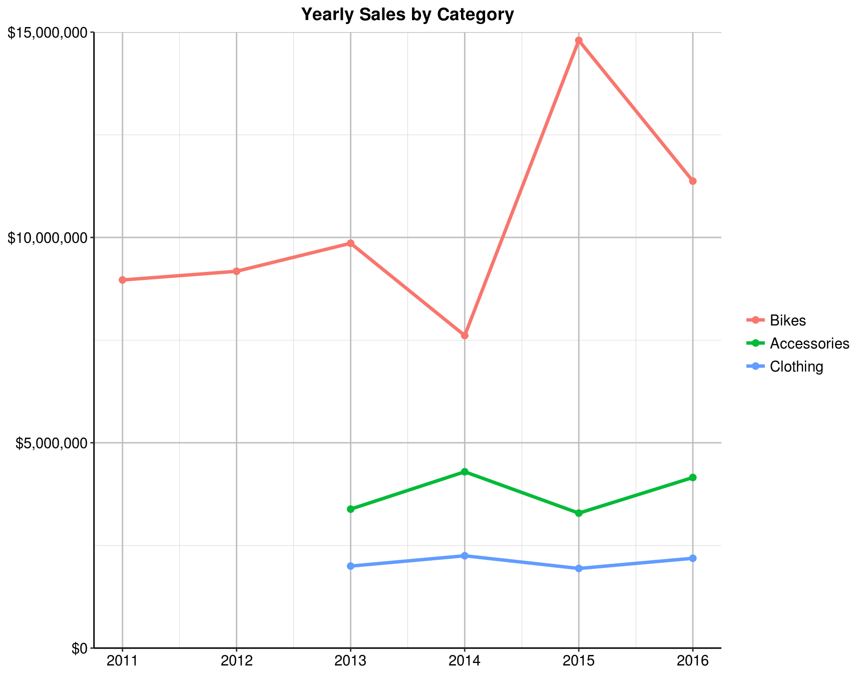
Answer: 2014
Add another pivot chart, this time for the pivot table that shows Revenue by Age Group. Select a pie chart to display the proportion of each Age Group. Add the labels to show percentage, formatted to two decimal points.
ans_3 <- my_data %>%
    group_by(`Age Group`) %>%
    summarise(Total = sum(Revenue)) %>%
    arrange(Total) %>%
    mutate(Prop = formatC(Total / sum(Total), digits = 4, format = "f") %>%
               as.numeric(),
           Percent = paste(Prop * 100, "%"),
           y_tick = cumsum(Prop) - Prop / 2)

ans_3$`Age Group` <- factor(ans_3$`Age Group`, levels = ans_3$`Age Group`)
kable(ans_3)| Age Group | Total | Prop | Percent | y_tick |
|---|---|---|---|---|
| Seniors | 308042 | 0.0036 | 0.36 % | 0.00180 |
| Youth | 11723199 | 0.1375 | 13.75 % | 0.07235 |
| Young Adults | 30655614 | 0.3595 | 35.95 % | 0.32085 |
| Adults | 42584153 | 0.4994 | 49.94 % | 0.75030 |
In this chart, we can clearly see the proportion of sales for each Age Group.
4.8 What is the proportion of sales for Young Adults?
ggplot(ans_3, aes(x = "", y = Prop, fill = `Age Group`)) +
    geom_bar(width = 1, stat = "identity", colour = "white", size = 0.7) +
    coord_polar(theta = "y") +
    labs(title = "Sales by Age Group", x = NULL, y = NULL) +
    geom_text(aes(x = c(1.6, 1.2, 1.1, 1.1), y = 1 - y_tick, label = Percent), size = 7) +
    theme(panel.background = element_rect(fill = "white", color = "white"),
          plot.title = element_text(face = "bold", size = 15, hjust = 0.5),
          legend.title = element_blank(),
          legend.text = element_text(size = 10, color = "black"),
          axis.text = element_blank(),
          axis.ticks = element_blank()) +
    scale_fill_brewer(palette = "Set1")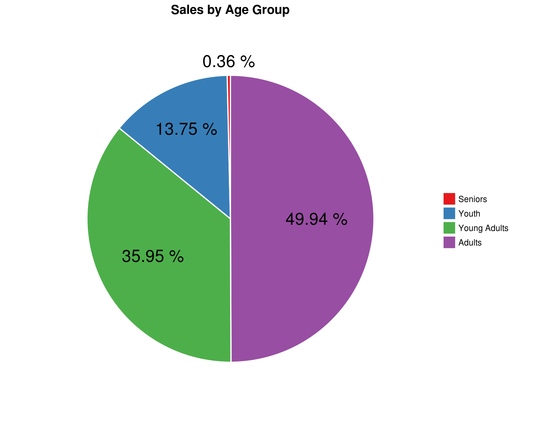
Answer: 35.95 %
Add another pivot chart, this time for the pivot table that shows Revenue by Frame size. Select a bar chart to display the order of sales by Frame size. Sort the Y axis to show the Frame size that has the most sales on the top.
ans_4 <- my_data %>%
    filter(!is.na(`Frame Size`)) %>%
    group_by(`Frame Size`) %>%
    summarise(`Total Revenue` = sum(Revenue)) %>%
    arrange(`Total Revenue`)
4.9 In this chart, you can clearly see the order of sales by frame size. Which frame size sold the least?
ggplot(ans_4, aes(x = reorder(`Frame Size`, `Total Revenue`), y = `Total Revenue`)) +
    geom_bar(stat = "identity", width = 0.7, show.legend = FALSE, fill = "tomato2") +
    scale_y_continuous(labels = scales::dollar, expand = c(0.01, 0),
                       limits = c(0, max(ans_4$`Total Revenue`)*1.05)) +
    coord_flip() +
    geom_text(aes(label = paste("$", prettyNum(`Total Revenue`, ","))),
              hjust = 1.1, colour = "black") +
    labs(x = "Frame Size", y = NULL, title = "Sales by Frame Size") +
    theme_classic() +
    theme(plot.title = element_text(face = "bold", hjust = 0.5),
          axis.text = element_text(size = 11, colour = "black"),
          axis.title = element_text(size = 12, face = "bold"))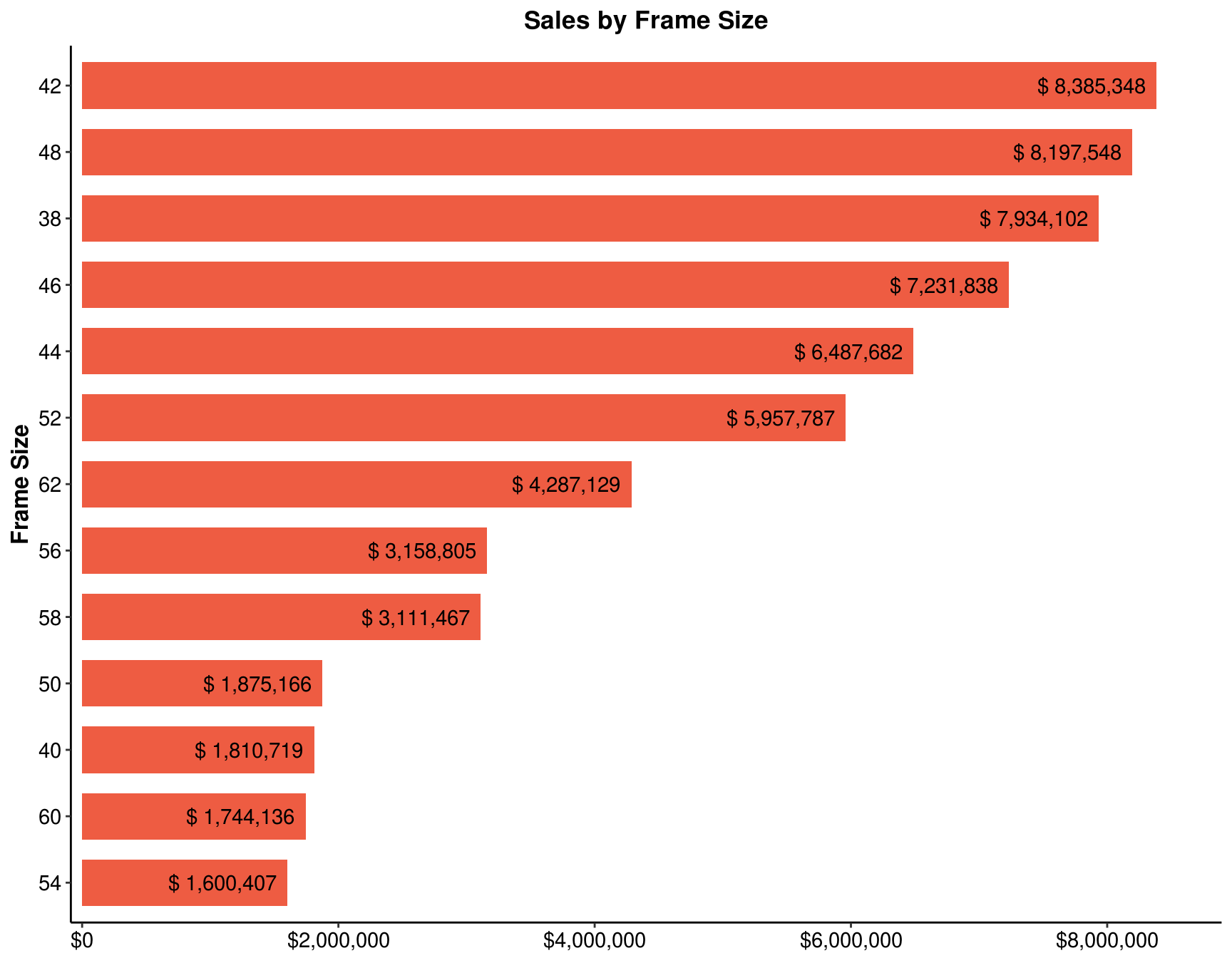
Answer: 54